Film title Scenes analysis
Film title Scenes
Here is a typical arrangement of opening credits in film:
PRODUCTION COMPANY presents
a NAME LASTNAME production
a NAME LASTNAME film
"TITLE"
Lead Cast
Supporting Cast
Casting Director
Music Composer
Costume Designer
Associate Producers
Editor(s)
Production Designer
Director of Photography
Executive Producer
Producer
Writer(s)
Director
a NAME LASTNAME production
a NAME LASTNAME film
"TITLE"
Lead Cast
Supporting Cast
Casting Director
Music Composer
Costume Designer
Associate Producers
Editor(s)
Production Designer
Director of Photography
Executive Producer
Producer
Writer(s)
Director
Catching Fire
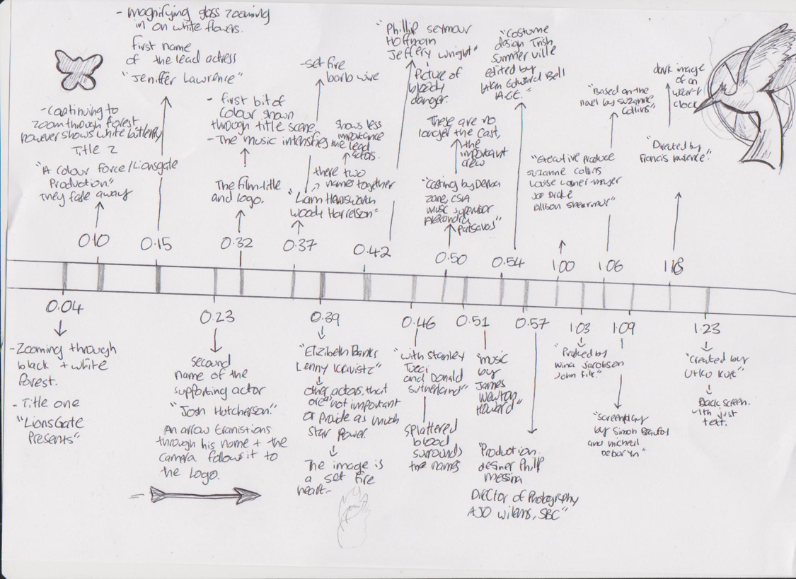
Here is a timeline of when the titles appear, with the images that correspond with them.
These titles last for one minuet, twenty nine second and the music Mercury- Full tilt- Convergence plays ambientently in the background.
The production company appears first, as "Lionsgate" is a well established institution it will allure an audience to watch as their previous films have been of high quality. The next name is of the protagonist and lead actress "Jennifer Lawrence," this placement is due to her star power because of her previous success in films. At the time of the release she was also a "hot topic" which will draw the audience even more. The next names are of the supporting actor "Josh Hutcherson" and "Liam Hemsworth." their fame will also attract audiences, especially female as they are known for being stereotypical attractive. After this the rest of the main cast follow such as "Elizabeth Banks" and "Stanley Tucci" They are after the lead actors as they do not appear in the film as much and the audience will be less interested in their roles.
Additionally, the crew follow, this is because they are important people in making the actual film but appear after the actors because they do not entice the audience to the extent of the cast.
The directors name is the last name of the credits, this is because they are the most important and will be the last thing the audience will see.

The Font
The font is Gothic Black and Century Gothic, the entire title scene is in all capitals, making it appear serious as this is when the series takes a darker turn.Zombieland:

Zombieland is a 2009 post-apocalyptic comedy film that stars Woody Harrelson and Jessie Eisenburg. It is about a shy student travelling across America in search of his parents, in a zombie filled world. He meets a series of interesting characters along the way.
The titles last for one minute forty-four seconds, and unlike Catching fire, it doesn't feature images but a series of different scenes in slow motion. The sound track used for this is Metallica - For Whom the Bell Tolls, it features few lyrics and empathizes the comedy genre as the song as juxtaposes with the images on screen. For example, when a zombie is running through someone's wedding in slow motion.The first title to appear is the production company again establishing its importance as the institution making the entire film possible.The next name is famous actor "Woody Harrelson" and whilst he May not be the protagonist he is the most established and well known lead the film has. This is used to generate an audience towards the film as they may be fan Woody Harrelson or note that he is in well respected films.The titles then follow with the protagonist, later accominied by the rest of the main cast. After that, the name of the film follows, this has larger letters then the rest of the text as it is the most significant, because of establishing the film. The crew follow this, but are different to the actors names as there are multiple in one scene instead of just a single title. The roles include producer, editors and the names responsible for costume and set design.

The Font
There is the use of a three-dimensional font, that is present throughout the entirety of the credits. They are red and have a sort of glowing tinge, the color is used to look . The letters are positioned literally in the middle in of the action, the people in the scene interact with the letters. For example, the zombies falls in to it so they come crashing down.The fonts seemelessly interact with the scene, and according to the creative director "The goal for the type was to respond to that horrific grace and react to the movement."

Scott Pilgrim

Scott Pilgrim is a 2010 action, comedy, fantasy film, in which Scott (Micheal Cera) has to defeat all of his crushes ex's to win her heart. The titles last for 2 minitues and 21 seconds, It has vast amount of names used in these titles because there is a massive cast. The first titles are the institutions behind the films followed by the actors in order of importance for example the lead "Micheal Cera" is first and then "Mary Elizabeth Winstead" who is the romantic interest of the protagonist and the driving point in the narrative. Many other names show up including "Chris Evans" and "Anna Kendrick" who provide star power for the film due to their fame. After this the crew members names appear, unlike the actors, more than one name take up the space. This could be because it was multiple people taking on the role, or because it would take up to much time showing them individually, boring the audience. The titles are successful in that hey express clear conventions of the genre and the nature of the film without giving anything away which entices the audience to want to know more.
The title of the film is established through the used of animations and graphics effects, producing the image the the sound created the title. This is used to show the fun nature of the film and to foreshadow the use of special affects, which are very apparent throughout the movie.

The Font

Casino Royale

Casino Royale is a 2006 action thriller from the iconic British film series "James Bond." This film follows secret agent 007 where he must defeat a weapons dealer in a high staked game of poker. The title sequence lasts for 3 minitues 15 seconds, The films institutions " Albert R. Broccoli's EON Production LTD" is the first text to show up, Broccoli was a world famous producer of James Bond films. Broccoli is well known in James Bond films and was an important person in establishing the previous Bond films. This is then followed by "Daniel Craigh" who is the protagonist and lead actor, this was his first film as James Bond and he had a lot of expectations to live up to. After this, the author and creaturer of Jame Bond appears "Ian Fleming," it states that this film is based off of his novel which excite fans of the book, already knowing that the story is enjoyable. The next names to appear are members of the cast such as "Eva Green" and "Mad Mikkelsen" followed by members of the crew, for example "Music by David Arnold"

The Font
 As the majority of the film is set in a casino, the title backgrounds have a card theme that is combined with the spy theme, establishing both the genre and foreshadowing the narrative of the film. The titles appear in an unusual way- they come onto the screen and then will slowly fade out, this is so that most of the attention is kept on the actions behind the titles, instead of being lost in confusing and graphic titling.
The font is clear and sophisticated, this was done to direct the focus to the interesting images on screen but also using a fancy or exaggerated font wouldn't tie in with the theme of prestige and class bond has in the film, as it would look childish and out of place.


Comments
Post a Comment